



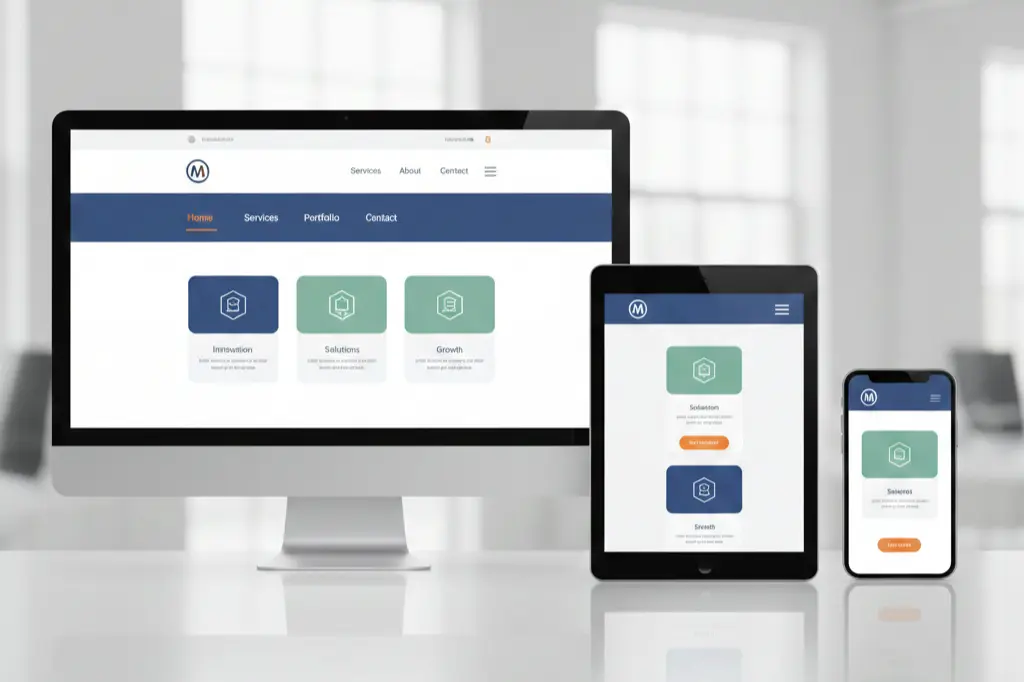
The digital landscape has changed. Dramatically.
We’ve all been there clicking on a website only to find ourselves lost in a maze of confusing menus, tiny text, and buttons that don’t work on mobile. Frustrating, right? Within three seconds, most visitors decide whether to stay or leave your site. That’s less time than it takes to brew coffee.
Building a user friendly website isn’t about following trends blindly or spending thousands on flashy animations. It’s about creating an experience that feels natural, trustworthy, and effortless for every single visitor who lands on your page.
At Paradigm Media Networks, we’ve helped countless businesses transform their digital presence from confusing to captivating. This guide shares what we’ve learned the good, the challenging, and the surprisingly simple strategies that actually work.
What Makes a Website Truly User Friendly
Here’s something we’ve noticed: everyone talks about user-friendly design, but few can define it clearly.
A user friendly website doesn’t make visitors think too hard. It guides them naturally from point A to point B. Whether someone wants to read your blog, buy a product, or contact your team the path should feel obvious.
Think of it this way: Your website is like a physical store. If customers can’t find what they need within minutes, they walk out. Same principle online, except they leave faster.
Core elements include:
- Navigation that makes sense at first glance
- Content that loads quickly (under 3 seconds)
- Text that’s readable without squinting
- Buttons and links that work on every device
- A design that feels secure and professional
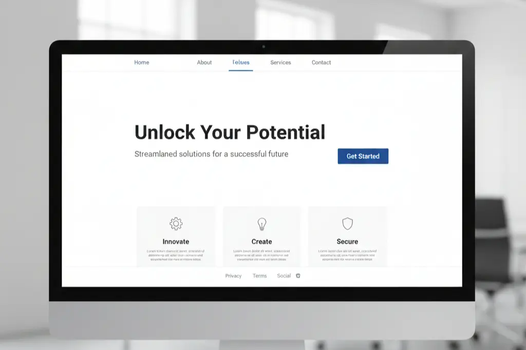
From an SEO perspective, Google’s algorithms favor sites that prioritize user experience. The correlation between usability and rankings? Stronger than ever in 2025.
Designing for Everyone (Including Your Least Tech-Savvy Visitor)
We worked with a client last year a local service business whose owner insisted their “customers aren’t tech people.” That phrase changed everything about our approach.
Your website needs to work for everyone. The 70-year-old booking their first online appointment. The busy parent checking your services during their lunch break. The executive browsing from their tablet.
Practical steps we recommend:
Start with your navigation menu. Can someone understand your site structure in five seconds? If not, simplify it. Use familiar labels like “Services,” “About,” and “Contact” instead of creative alternatives that confuse people.
Readable fonts matter more than you think. We’ve seen conversion rates jump by 15% just from increasing font size and improving color contrast. Choose fonts that are easy to read on small screens typically 16px minimum for body text.
Make your call-to-action buttons obvious. Not subtle. Not artistic. Obvious. Use contrasting colors and clear language like “Get Started” or “Request Quote” instead of vague phrases.
Write like you’re explaining something to a friend. Avoid industry jargon unless your audience specifically expects it. Short paragraphs work better than long blocks of text.
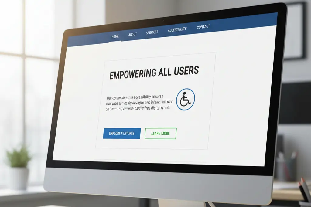
Here’s what happens when you get this right: people stay longer, click more, and actually complete the actions you want them to take.
Current Design Trends That Actually Improve Usability
Design trends come and go. Some are purely aesthetic. Others genuinely improve how people interact with websites.
What’s working in 2025:
Minimalist layouts have staying power because they reduce decision fatigue. When visitors aren’t overwhelmed by choices, they make decisions faster. At Paradigm Media Networks, we’ve seen this principle boost engagement consistently.
Mobile-first design isn’t trendy it’s essential. Over 60% of web traffic comes from mobile devices now. Designing for mobile first, then expanding to desktop, ensures your site works where most people actually use it.
Micro-interactions add personality without complexity. A button that slightly changes color on hover. A form field that shows a checkmark when filled correctly. These tiny details make interfaces feel responsive and alive.
AI-powered chatbots provide instant help without forcing visitors to search through FAQ pages. But here’s the catch they need to be helpful, not annoying. Bad implementation does more harm than good.
Dark mode options respect user preferences and reduce eye strain. Implementing this shows you care about visitor comfort.
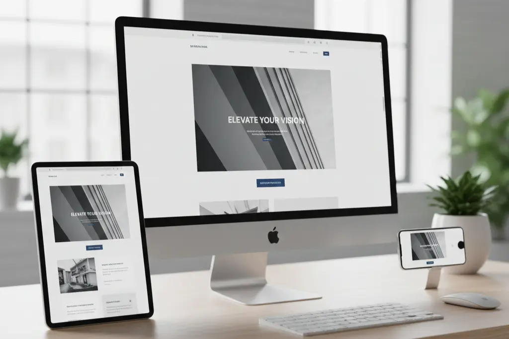
The key? Choose trends that serve your users, not just your aesthetic preferences.
The Hidden Cost of Poor Website Design
Let’s talk numbers because that’s what ultimately matters.
We once audited an e-commerce site losing 70% of potential customers before checkout. The culprit? A confusing seven-step checkout process with unclear shipping information. After simplifying to three steps and adding progress indicators, conversion rates doubled.
How bad usability kills revenue:
Slow page speeds cost you visitors before they even see your content. Research shows that 53% of mobile users abandon sites that take longer than three seconds to load. Every second counts.
Complicated forms drive people away. Each additional form field reduces completion rates. We’ve tested this repeatedly asking for only essential information upfront dramatically improves submissions.
Poor mobile experiences cause immediate exits. Buttons too small to tap accurately. Text requiring pinch-to-zoom. Horizontal scrolling that shouldn’t exist. These aren’t minor annoyances they’re conversion killers.
Unclear navigation leaves visitors guessing. When people can’t find what they need, they leave and find a competitor who makes it easier.
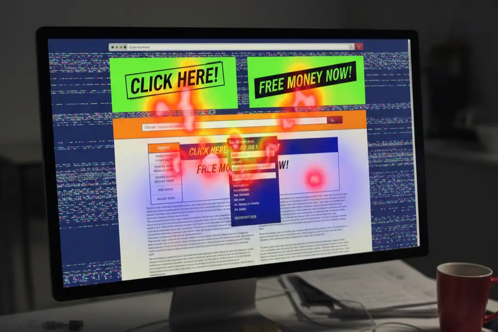
A difficult-to-use website doesn’t just frustrate users. It signals to search engines that your site doesn’t deserve top rankings. Google tracks bounce rates, time on site, and other engagement metrics that directly reflect usability.
Professional Design: What It Really Means
There’s a misconception that professional design means expensive and complex.
Wrong.
Professional design means your website looks credible, functions predictably, and communicates clearly. It’s about consistency more than creativity.
What makes design professional:
Brand consistency throughout every page. Your colors, fonts, and style should feel cohesive. When visitors move from your homepage to your services page, they should feel like they’re still on the same website.
Logical layouts that match user expectations. People expect logos in the top left corner. Contact information in headers or footers. These conventions exist because they work.
Error-free content is non-negotiable. Typos and grammatical mistakes destroy credibility faster than any other design element. Proofread everything.
Optimized performance shows you respect visitor time. Images should be compressed. Code should be clean. Pages should load quickly.
Accessibility compliance isn’t just ethical it’s practical. Sites that work for people with disabilities usually work better for everyone.
At Paradigm Media Networks, we’ve learned that professional design builds confidence. When visitors trust your site, they trust your business.
Mobile Design Mistakes That Kill Conversions
Mobile optimization isn’t optional anymore. Yet we see the same mistakes repeatedly.
The most damaging errors:
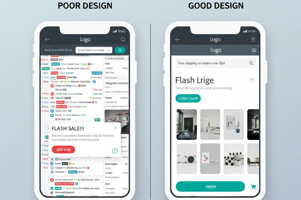
Tiny buttons that require precision tapping. If someone needs multiple attempts to click your CTA button, you’ve already lost them. Make buttons large enough for easy tapping minimum 44×44 pixels.
Text that requires zooming frustrates mobile users instantly. If your font size looks fine on desktop but needs zooming on mobile, it’s too small. Use responsive typography that adjusts automatically.
Intrusive pop-ups that cover entire mobile screens anger visitors and harm your SEO. Google specifically penalizes sites with aggressive mobile pop-ups. If you must use pop-ups, make them easy to dismiss and delay their appearance.
Ignoring thumb zones creates usability issues. Most people hold phones one-handed and use their thumbs to navigate. Place important elements within easy thumb reach typically the middle and bottom of the screen.
How to avoid these mistakes:
Test your site on actual mobile devices, not just desktop simulators. Ask non-tech-savvy friends to complete key tasks on their phones. Watch where they struggle.
Use responsive design frameworks that automatically adjust layouts. Don’t create separate mobile and desktop versions maintain one responsive site.
Prioritize speed ruthlessly. Mobile connections vary. Your site needs to work on slower networks too.
Creating Unique Designs on a Shoestring Budget
Small budgets don’t mean generic websites.
We’ve helped businesses create distinctive sites without massive investments. The secret? Focus on content and smart template customization rather than custom development from scratch.
Budget-friendly strategies that work:
Premium WordPress themes provide professional foundations affordably. Choose themes from reputable marketplaces, then customize colors, fonts, and layouts to match your brand. This costs a fraction of custom development while delivering professional results.
Content-driven design prioritizes your message over decorative elements. Strong writing, compelling headlines, and strategic use of whitespace create visual interest without expensive graphics.
High-quality photography makes enormous impact. Instead of expensive photoshoots, use services offering authentic stock photos or create simple, well-lit photos yourself. Consistency matters more than production value.
Strategic use of color differentiates your site without complexity. Choose a distinctive color palette and use it consistently. This creates memorable branding on any budget.
Focus on typography as a design element. Different font combinations create completely different feels. Experiment with free Google Fonts until you find combinations that represent your brand.
Your unique selling proposition matters more than visual complexity. Communicate clearly what makes you different. Great content on a simple template outperforms mediocre content on custom designs every time.
Building Trust Through Design Choices
Trust determines whether visitors become customers.
Visual trust signals include:
SSL certificates (HTTPS in the address bar) are baseline requirements now. Browsers warn users about non-secure sites. If you don’t have HTTPS, you’re signaling carelessness.
Client testimonials with real names and photos build credibility. Generic testimonials without attribution do more harm than good. If possible, include photos and company names (with permission).
Clear contact information shows you’re not hiding. Display phone numbers, email addresses, and physical addresses prominently. Businesses that make themselves hard to contact seem suspicious.
Professional imagery signals competence. Blurry photos, inconsistent image styles, or obviously generic stock photos undermine credibility. Invest time in sourcing or creating quality images.
About pages that humanize your business connect with visitors emotionally. Share your story. Show your team. Explain why you do what you do.
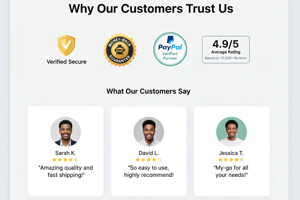
At Paradigm Media Networks, we emphasize that trust isn’t built through single elements it’s the cumulative effect of dozens of small choices that either reassure or worry visitors.
Essential Website Safety Steps
Safety isn’t just technical it’s visual reassurance.
Visitors make split-second judgments about whether your site is safe. These judgments affect bounce rates, form submissions, and conversions.
Simple but effective safety measures:
Enable HTTPS and display security badges prominently, especially on checkout and contact forms. This costs little but significantly impacts trust.
Keep software updated including your CMS, plugins, and themes. Outdated software creates vulnerabilities that hackers exploit. Enable automatic updates when possible.
Use secure forms with proper validation. Forms should use HTTPS, include spam protection, and validate data before submission. Show clear privacy statements near forms explaining how you’ll use submitted information.
Avoid intrusive advertising that might trigger security warnings. Sketchy-looking ads damage credibility even if they’re technically safe.
Display privacy policies and terms clearly. Link to them in your footer. This shows transparency and legal compliance.
Regular backups protect against disasters. Automated daily backups mean you can recover quickly if something goes wrong.
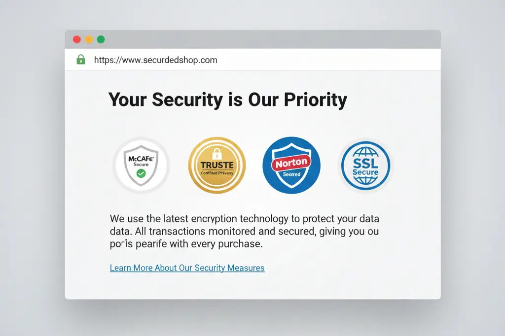
These steps reassure visitors while actually protecting them. Win-win.
Frequently Asked Questions
Why does user friendly website design impact SEO rankings?
Google’s algorithms prioritize user experience signals including page speed, mobile usability, and engagement metrics like time on site and bounce rate. A user friendly website naturally performs better in these areas, leading to improved rankings. Search engines want to direct users to sites that satisfy their needs quickly and effectively.
How often should we review website usability?
We recommend comprehensive usability audits every six months minimum. However, monitor key metrics monthly bounce rates, conversion rates, and page speed. Major updates, redesigns, or algorithm changes warrant immediate reviews. User behavior changes over time, so continuous improvement beats periodic overhauls.
Can slow website speed really hurt conversions that much?
Absolutely. Research consistently shows that 53% of mobile users abandon sites taking longer than three seconds to load. At Paradigm Media Networks, we’ve measured conversion rate improvements of 20-30% just from speed optimization. Every additional second of load time decreases conversions exponentially.
What’s the biggest mistake small businesses make with website design?
Trying to do everything at once. Small businesses often cram too much information, too many features, and too many calls-to-action onto pages. Simplicity wins. Focus on one clear goal per page and guide visitors toward it. A simple, focused user friendly website outperforms a complex one every time.
How do we make our website stand out without a big budget?
Focus on your unique story and clear value proposition. Distinctive content, authentic photography, and consistent branding create memorability regardless of budget. Use your voice write like you talk, share real examples, and show personality. Many expensive websites feel generic because they lack authentic content.
Does mobile-first design mean desktop doesn’t matter?
Not at all. Mobile-first means designing for mobile constraints first, then expanding for larger screens. This approach ensures your site works everywhere. Desktop still matters, especially for B2B businesses where many decisions happen on office computers. The key is responsive design that adapts seamlessly across all devices.
Your Website Should Work As Hard As You Do
Building a user friendly website isn’t a one-time project it’s an ongoing commitment to serving your visitors better. Every improvement, no matter how small, contributes to better experiences, higher conversions, and stronger business results.
We’ve covered the essentials: simplicity in navigation, speed in loading, clarity in communication, and trust through design choices. The businesses that thrive online aren’t necessarily those with the flashiest sites they’re the ones that remove friction from user journeys.
Start with one improvement this week. Maybe it’s increasing your font size. Maybe it’s simplifying your navigation menu. Maybe it’s speeding up your slowest pages. Progress beats perfection.
Your visitors deserve websites that respect their time and intelligence. Give them that experience, and they’ll reward you with engagement, trust, and conversions.
Ready to transform your website from confusing to converting? At Paradigm Media Networks, we specialize in creating high-performance, user-centric websites that actually drive results. Our team combines technical expertise with design thinking to build sites people love using and search engines love ranking.
Let’s talk about your website goals. Whether you need a complete redesign, mobile optimization, or strategic improvements to boost conversions, we’re here to help. Visit us at https://paradigmmedianetworks.com/ to explore how we can elevate your digital presence.
Your website is your hardest-working employee. Make sure it’s equipped for success.